Great opportunities can find you at the strangest of times. How I got involved with My Hungry Head is the craziest story, but I'm sure glad I did. After the creator of MHH saw a project I made in college, she knew she had to sign me on to create the cover of her upcoming book and work for her company. While most of the projects I have done for MHH were for internal use, I have also created a few logos for programs in the MHH family.
But that's not what we're here to talk about...
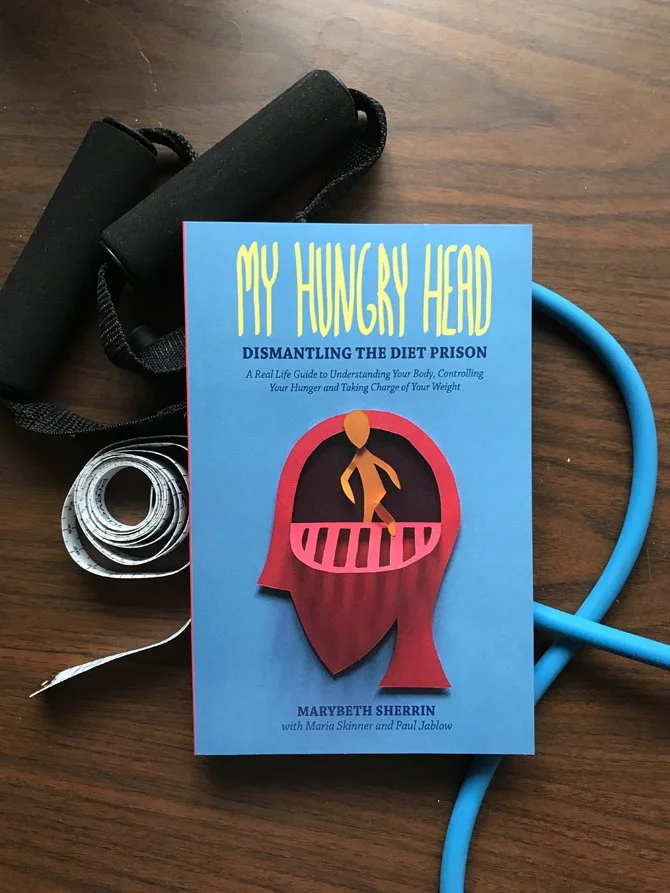
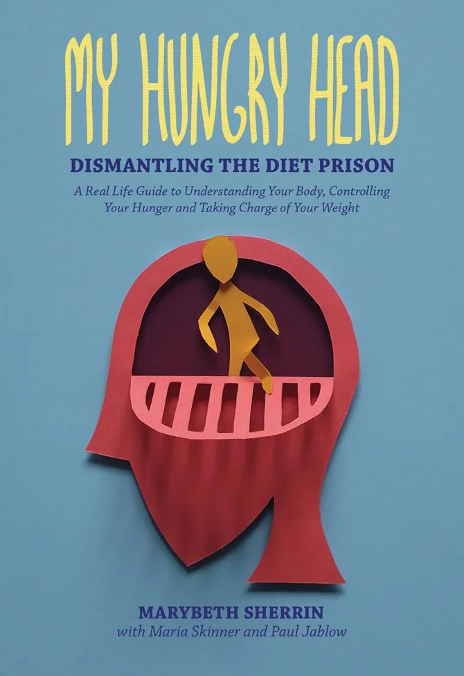
As my first paid project, I wanted to make sure that I put my heart and soul into this book cover. This book is the first step into a broader public market for MHH and I wanted to help them create a great impression.
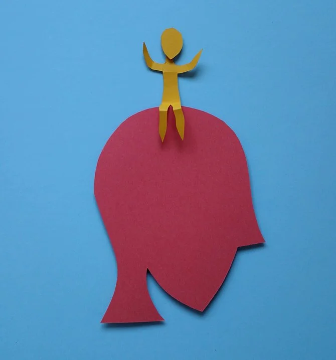
We knew the cover had to symbolise hunger and heads, but how?
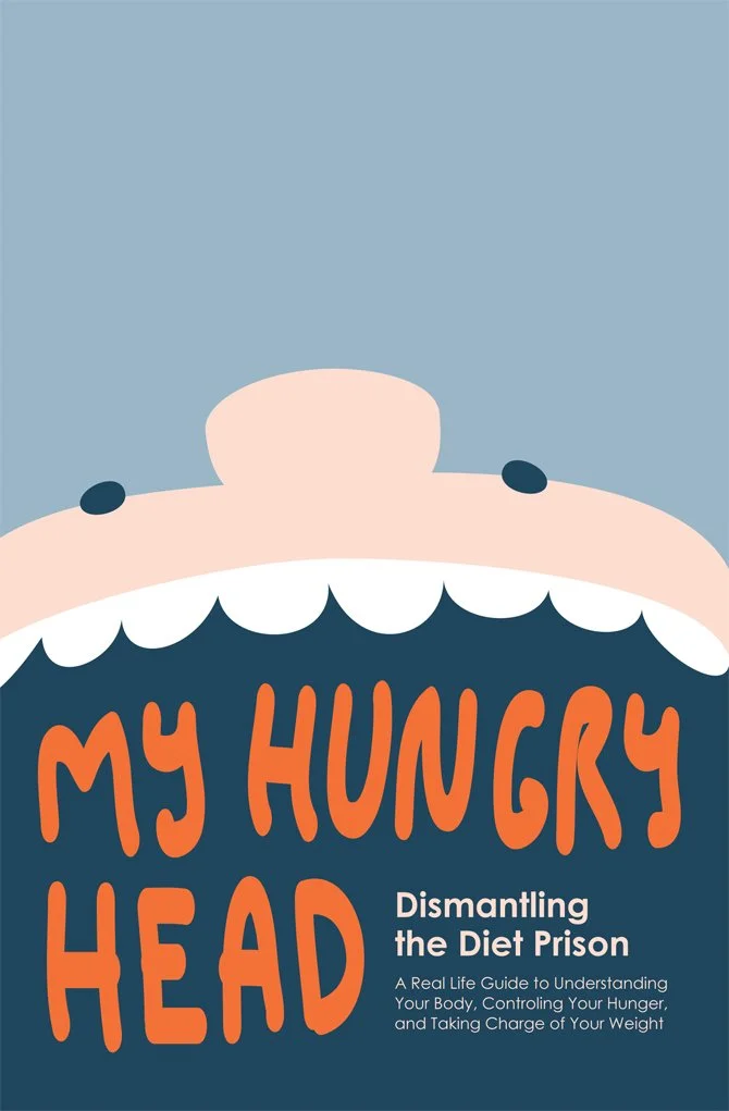
A very earlier version.
Tossing around idea, after idea, after idea, we finally settled on the literally concept of breaking out of your "hungry head's diet prison." We finally knew what direction we wanted to take it in, but had to work out the fine details of colour and aesthetic.
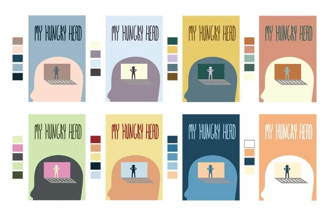
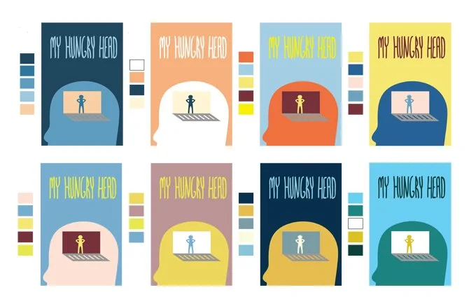
There were so sources of inspiration for colour palette, from oil paintings to the company's original branding. A lot of time was dedicated to creating some palettes.
We settled on a collection of colours inspired by the original branding, just a bit more "fun." Wanting to take a risk, we went for a more angular face shape than the more realistic look of the MHH logo.
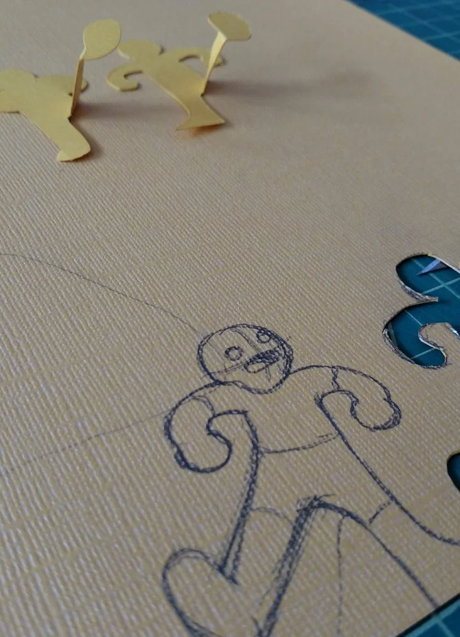
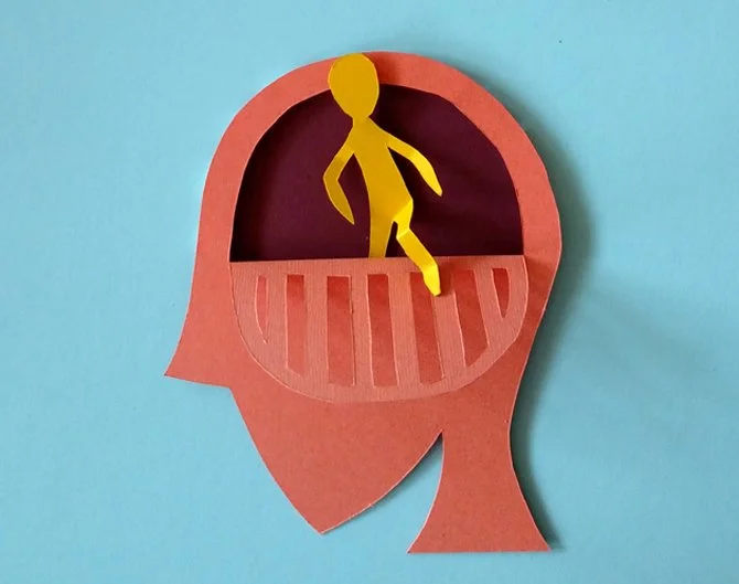
Then came the time to take the Illustrator sketch and turn it into a cut-paper illustration. I created a few different iterations of the cover to create the right sense of dimensionality. There was one that even included a back cover illustration that was later removed for a more minimal look.
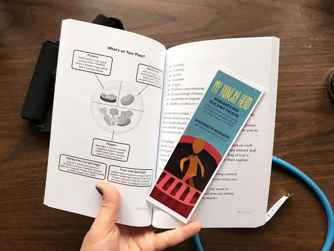
Before we knew it, it was time to send the files to the publishers and the book became a physical object you could hold and read! These were exciting times and a bookmark was made to commemorate the book launch. I learned a lot from this experience that has stuck with me as I worked on more projects for this company.